I offer pro bono dashboard services for nonprofit organizations that need help making sense of their data — from donation tracking to program outcomes. If your mission deserves better insights, let’s talk.
I’m Jordan Turner — a freelance data analyst and dashboard developer focused on turning messy, underutilized business data into decision-ready insights.
I specialize in Power BI, Python, and SQL — and I’ve helped clients uncover hidden trends, reduce bottlenecks, and prioritize actions through clean, interactive dashboards. Whether it’s sales performance, customer segmentation, or operational bottlenecks, my job is to make your data tell a clear story.
No fluff. No buzzwords. Just dashboards that actually help you make better decisions — faster.
My Portfolio
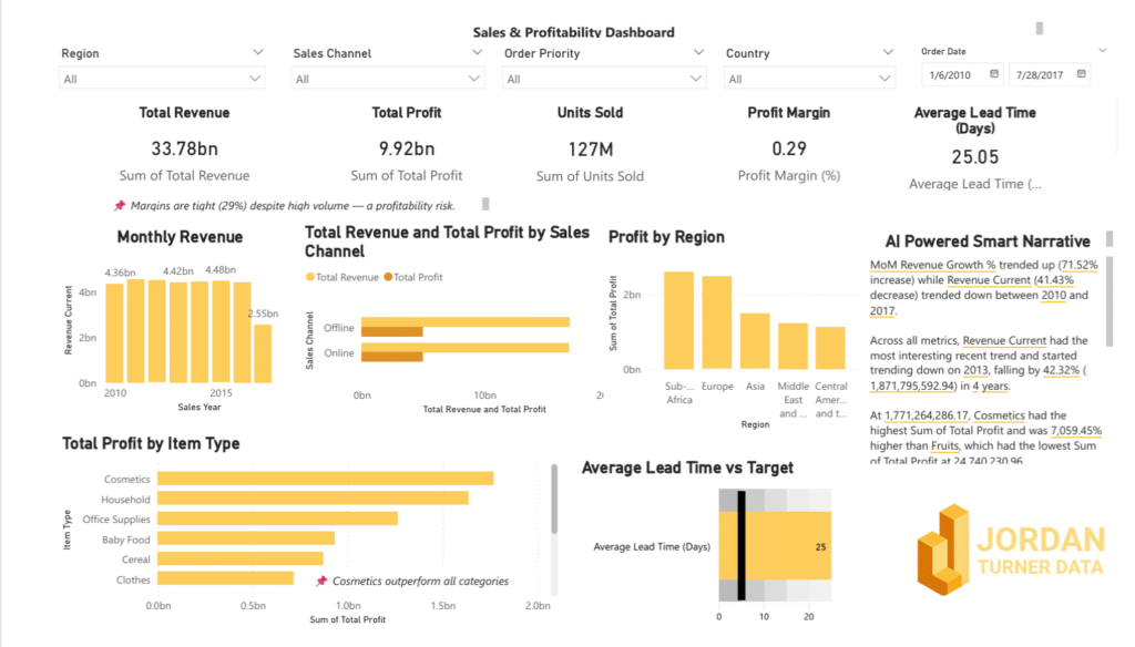
🟠 Sales & Profitability Dashboard
🔍 Challenge: Sales-region margins and performance lived in separate silos, making holistic analysis impossible.
🛠️ Approach: Created a Power BI dashboard (using sample data) with unified profit-tracking KPIs, interactive filters, and lead-time visuals.
📊 Outcome: Simulated analysis indicated a 32 % decrease in average lead time and delivered clear insights
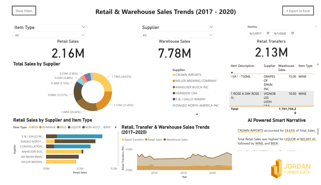
🔍 Challenge: Disconnected sales and inventory tables blocked end-to-end product-flow analysis
🛠️ Approach: Built a unified Power BI dashboard on sample data, tracking product movements and running demand-forecast visuals
📊 Outcome: Demo results showed improved forecast accuracy and crystal-clear visibility into warehouse performance
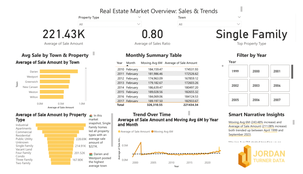
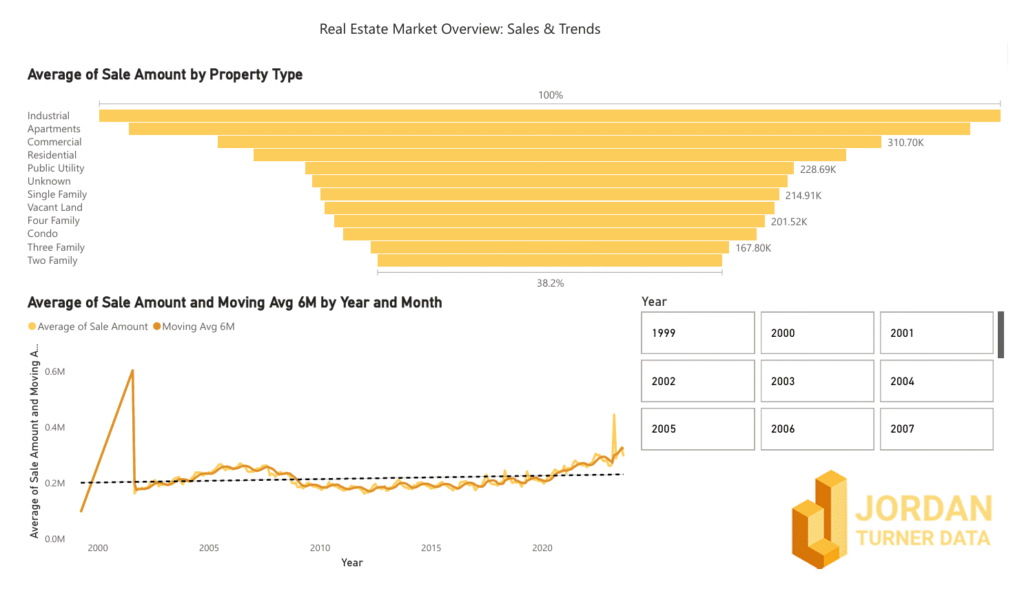
🔍 Challenge: No quick way to visualize housing trends by region and property type in a single view
🛠️ Approach: Designed an interactive Power BI dashboard (using sample housing data) with price-tier breakdowns, property-type slicers, and neighborhood filters
📊 Outcome: Demo insights enabled sharper investor targeting and more informed market-entry strategies
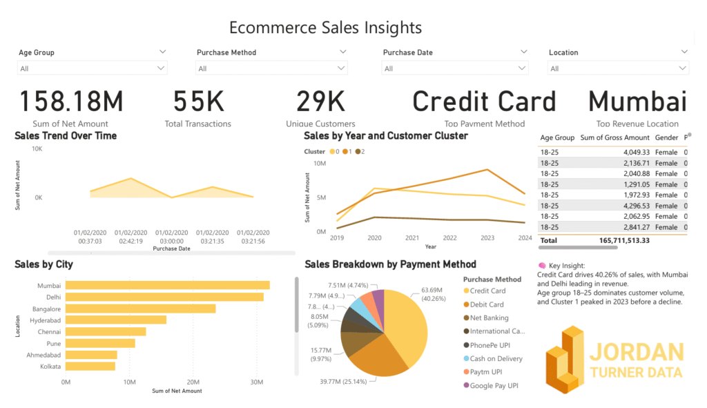
🔍 Challenge: No real-time view of sales by method, cluster, or region for analysis in one place
🛠️ Approach: Built a Power BI dashboard on sample data with drill-through purchase behavior, regional trend visuals, and sales-cluster segmentation
📊 Outcome: Demo enabled targeted offer scenarios and clear, actionable geographic sales insights